Everyone is familiar with the phrase: “don’t judge a book by its cover”. But we are all guilty of doing this sometimes. The saying also applies to online videos. If the thumbnail is inviting, chances are viewers will click.
Sometimes organizations have amazing video content. But they end up making poor choices when it comes to the thumbnail. This can cause the number of clicks to be somewhat disappointing, while the right custom thumbnail can increase your click rate with 34%. So, beware of these five thumbnail mistakes, so you can avoid them.
#1 Candid thumbnail
Do you have video content with talking heads? Then we advise you to go with the thumbnail with the friendliest face. Seeing a friendly face helps build trust.
Make sure you choose a good facial expression. We have seen examples of thumbnails with faces with closed eyes, faces that are out of focus or have a weird expression. For example, someone who is yawning or is just about to sneeze.
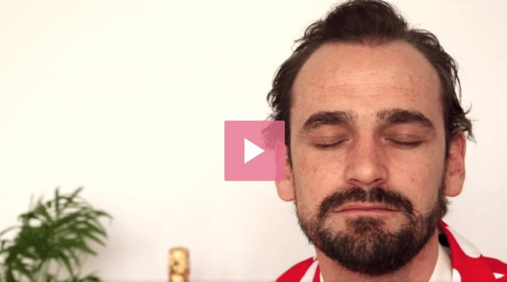
Tip: When a face appears in your thumbnail, look at it as a photo for elementary school: you want someone to look their best.
#2 Boring thumbnail
Your video content looks excellent and is substantive, but the thumbnail is tedious. Either a thumbnail in a monotone color, such as black or grey. Or a thumbnail with a nondescript object or indecipherable graph. Not much is happening and the subject of the video remains in the dark.
Tip: Pick a thumbnail with a more colour and preferably one with a bit of action. Something that triggers curiosity and looks inviting. Give a little hint, so people have to click to find out what happens next.
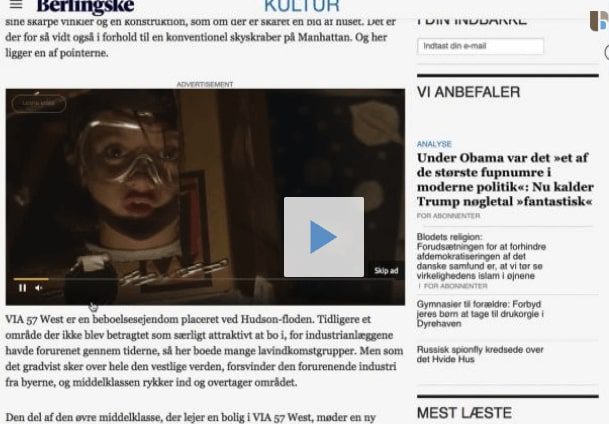
#3 Thumbnail search picture
When creating an online video, you want people to watch it from beginning to end. But first, people need to start watching. Make it easy as possible by having an obvious play button. Sometimes the play button blends in with the thumbnail. For example, because it has the same colour as the background.

Tip: Besides having a big play button in the middle of your thumbnail, you can add a player bar at the bottom. This way there is no mistake that a video is about to play. And the viewer has two options to hit play.
#4 Blurry thumbnail
Usually a thumbnail is a snapshot of a video. Sometimes this leads to images that are out of focus and blurry. This can make it difficult to decipher what the video is about. And the guessing game is not very inviting to viewers.

Tip: You have an entire video to create a new thumbnail. So, why not go for the best option possible? Or create a thumbnail by using a still that you upload yourself.
#5 No (con)text
Choosing the right thumbnail can be a battle. On the one hand you want a visually stunning thumbnail that will make people click and on the other hand you want a clear thumbnail that communicates the subject of your video.
A thumbnail that solely consists of an image can leave your video without any context, since titles and descriptions for your video can be invisible or incomplete.

Tip: add a short title or a catchy Call to Action to your thumbnail, that includes more detail on what the video is about. For example, you can state the episode number if the video is part of a larger video series. Make sure the text can be read on any size screen and that it’s placed in a spot that is always visible.
Custom thumbnail done the right way
So far we’ve told you about what not to do when it comes to thumbnails. So, let’s end with some tips on how to create the eye-catching thumbnails.
Consistency is key
Are you making a video series? Consider creating a format for the thumbnails of your videos. For example, the series of cooking videos by Jamie Oliver. He uses a picture of the chef with the dish and a banner with his name. Creating a format allows you to brand your thumbnails, making it easier for your audience to recognize your videos. It’s also an excellent way to indicate when a video is part of a series. For example, giving every video in a series the same title, the same color banner or the same presenter.
Grab the attention
You want people to click and watch. So, create suspense and some sense of mystery in your thumbnail. This way, people have no other choice but to click if they want to find out what happens next.
Testing, testing
Just try it! Once you decide on a thumbnail, it’s not set in stone. Make sure you test multiple options to find out what works and where you can optimize.
Make a thumbnail
Often an online video platform already offers some pre-selected thumbnails that you can choose from. But you can also easily create one yourself. The Blue Billywig Online Video Platform offers the Thumbnail Generator. This allows you to take snapshots directly from your video. The last option is to create your own thumbnail with Photoshop or InDesign, and upload this to the platform.

Want to learn more? Explore our other updates


Find out how our platform can support your video strategy
Fill out the form and one of our video experts will happily show you around our platform and answer any questions you might have.